Civic Tech Jobs
A responsive website that makes it easy to find local volunteer opportunities in a variety of industries.
Team: Jen Chung (Lead UX/UI Designer), Grace Lin (UX/UI Designer), Janzen Molina (UX/UI Designer), et al.
Background
With a bit more design experience, I was eager to discover what the UX designer experience would be like in a more industry-like setting. I set out for opportunities that would allow me to utilize my design skills on website or mobile app mockups similar to what was being produced for the general public. I was introduced by the Hack for LA project to a colleague where I became greatly interested in their non-profit work and organizational structure that mimicked that of an actual company.
Objective
As part of the Civic Tech Jobs team, our product was meant to serve three purposes:
- Help prospective volunteers find inter disciplinary projects that will be useful for their career development
- Give the larger Hack for LA projects organization a place to be able to list their open roles.
- Match volunteers by availability, role, and program area in a way that a volunteer can better prepare themselves for the marketplace
Banner
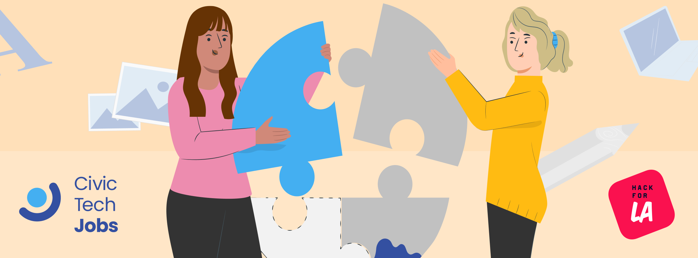
When initially starting my work in Figma, I tested my understanding of the program's core functionalities by creating a 2D banner. I had initially begun work on the banner in Illustrator, but in order to maintain consistency in the overall workflow, I began to use the same tools as the other designers.

2D banner I created that pleased a difficult stakeholder
Paper Prototypes
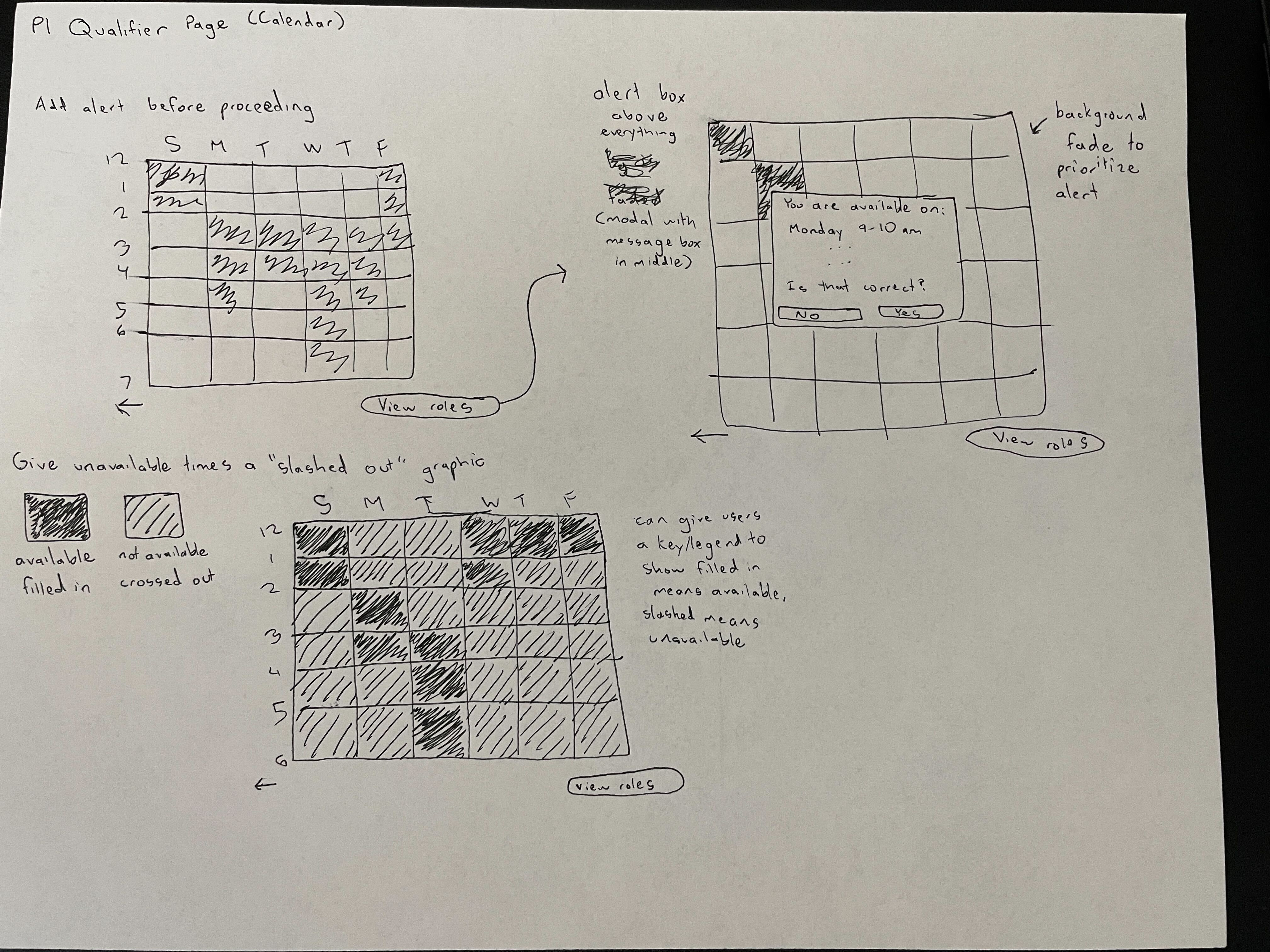
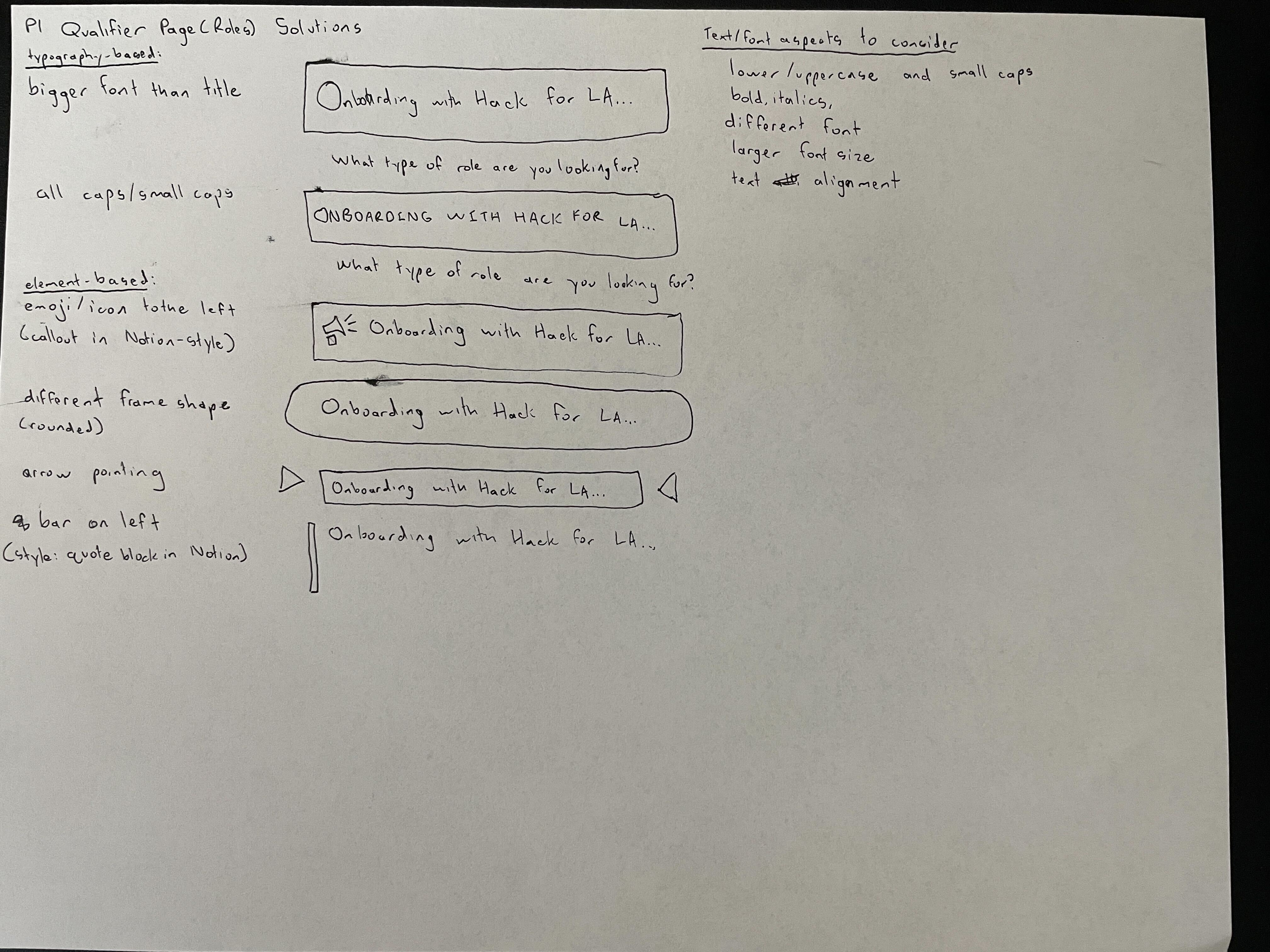
In order to rapidly explore different options for the design of certain elements, I used a paper prototyping process where I took a maximum of 10 minutes to come up with as many different iterations of the element as possible within the time limit. The process was fluid in the sense that a lot of the time, the minor details would not be given in order to maximize the amount of iteration happening in the given time, but in some cases, I would give a bit more detail in order to better flesh out a single idea that I thought laid a good foundation for future iterations.
Wireframes
I translated my ideas from paper into a more visually complete wireframe on Figma. These mid to high fidelity wireframes would serve as a method of teaching developers our ideas on how the project was to be laid out, with details like icon placement and spacing between the elements being included in the process.
One concept that I had running continuously throughout my wireframes was the use of icons and picture-based information in tandem with shorter text. I thought this would improve efficiency and reduce confusion when it came to translating the website into other languages, which I thought was significant due to Hack for LA's far reach in terms of different demographics, backgrounds and languages. Improvements such as these would help with accessibility and the overall user friendliness for our website.
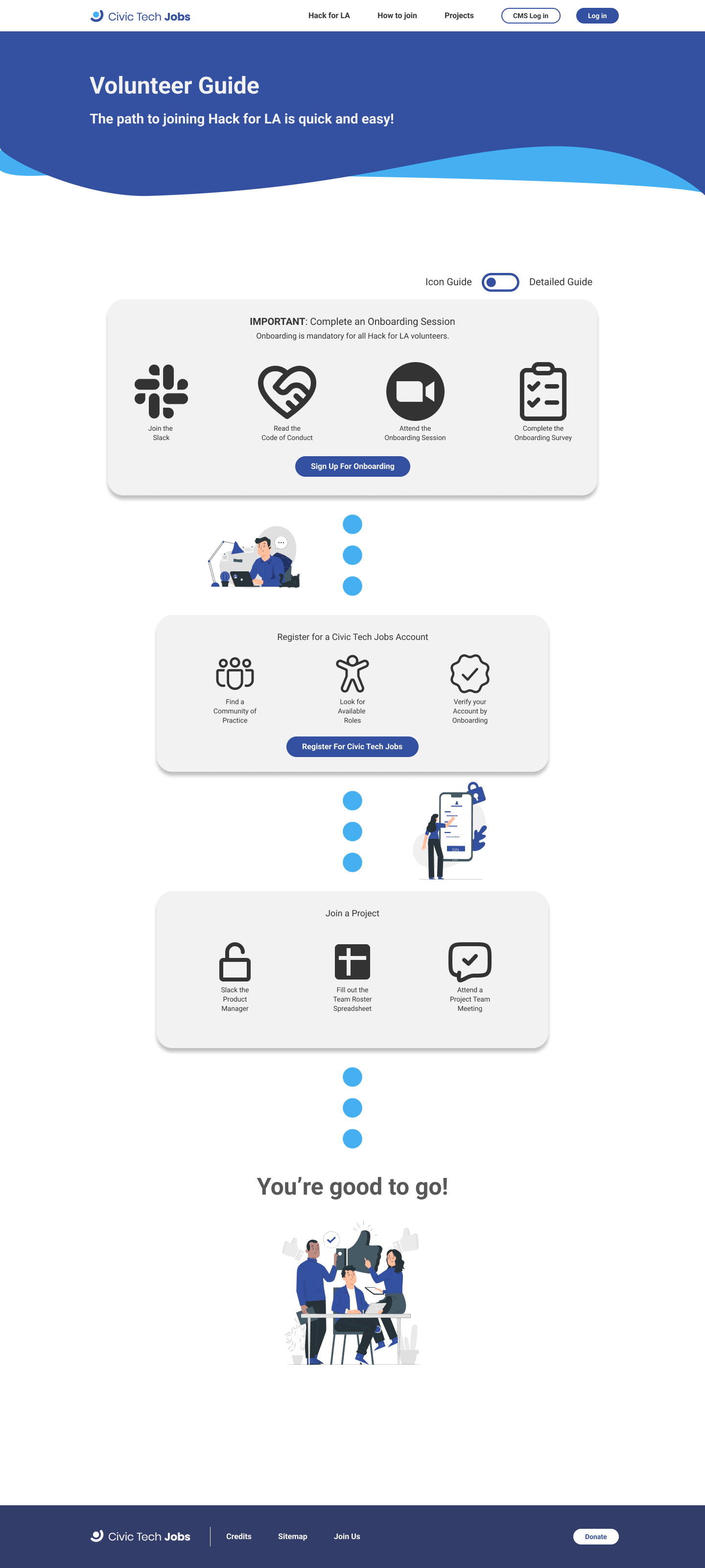
How to Join page wireframe prioritizing icon view
Design System
In order to design with efficiency and consistency, we organized our repetitively used components into a design system, which I contributed to by taking an instance of an element from the website and standardizing it to be used in various wireframes and prototypes in the future. This required pixel-perfect precision in order to guarantee that instances of each component did not look inaccurate to what was going to be made as part of the final website development.
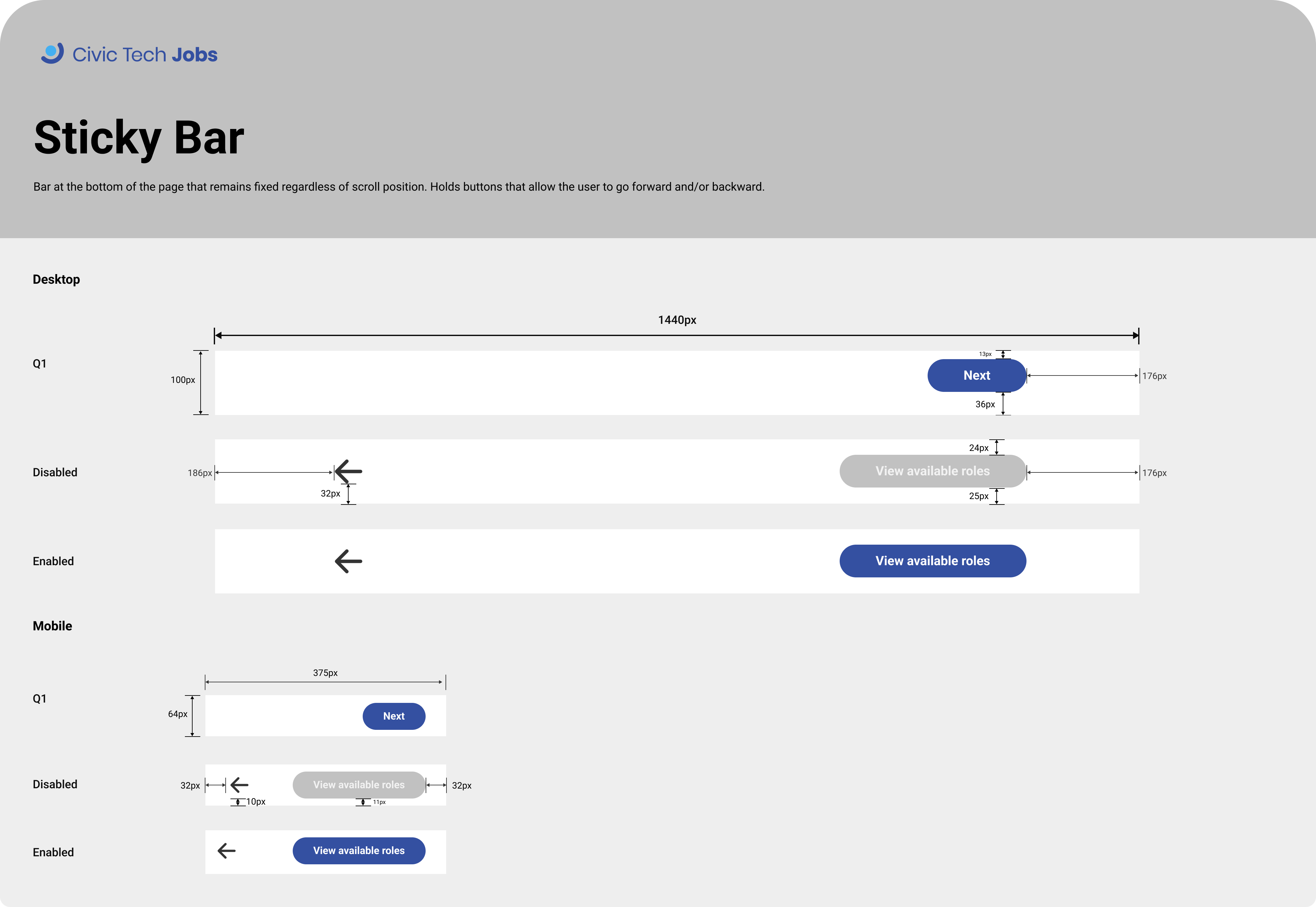
Sticky bar component card
Usability Testing
Although we were not explicitly UX researchers, the design team was called to host usability testing sessions as a means of gaining experience and assisting the research team due to a constraint on resources at the time. In order to get a better understanding of what the process was like, I observed a researcher host their own session while I took some notes and informed my future designs based on the insights our team received from that session. When it came to leading a session, however, I ended up not hosting a session before the testing for that particular iteration of the design had concluded.
Reflection
One of my greatest regrets as part of this position (and as a designer in general) was not taking up the offer to conduct my own usability testing. As of writing, I have been a part of conducting usability testing, so the experience itself was not that much of a loss, but more so that I could have taken the initiative and gotten that experience earlier if I was not afraid to fail. Moving forward, I strive as a designer to take charge of my work and take the opportunity if it's given to me rather than being timid and staying behind a safety net. I might fail, but I know now that it's an important part of learning: to gradually learn and improve, and learn from one's mistakes.
Beyond being more inclined to take risks and not be afraid to fail, I also learned much about the design process itself. One important lesson was that UX/UI design is not about reinventing the wheel in terms of interactions with users; although it's important to make designs unique and relevant to each individual product, the overall user flow and layout of elements could be very similar to an already existing solution, which is alright. I found that trying to develop new ideas for the sake of being novel was an inefficient and overall ineffective use of time and resources, so knowing what works and what doesn't played an important role in my design process.
